Turn on suggestions
Auto-suggest helps you quickly narrow down your search results by suggesting possible matches as you type.
Dashboards & Visualizations
×
Are you a member of the Splunk Community?
Sign in or Register with your Splunk account to get your questions answered, access valuable resources and connect with experts!
Turn on suggestions
Auto-suggest helps you quickly narrow down your search results by suggesting possible matches as you type.
- Find Answers
- :
- Using Splunk
- :
- Dashboards & Visualizations
- :
- How can I show a key to define each color of my pi...
Options
- Subscribe to RSS Feed
- Mark Topic as New
- Mark Topic as Read
- Float this Topic for Current User
- Bookmark Topic
- Subscribe to Topic
- Mute Topic
- Printer Friendly Page
- Mark as New
- Bookmark Message
- Subscribe to Message
- Mute Message
- Subscribe to RSS Feed
- Permalink
- Report Inappropriate Content
How can I show a key to define each color of my pie-chart?
tamduong16
Contributor
08-11-2017
02:54 PM
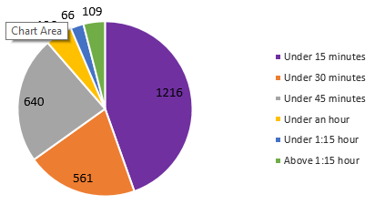
Is there a way I could get Splunk to display piechart like this?
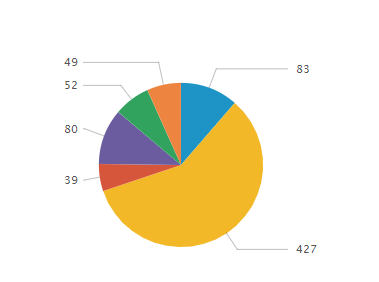
I want it to display what each color is and the count of each slice. I were able to get it to display only the count for each slice (below image) but I need to see the description of the color on the side.
- Mark as New
- Bookmark Message
- Subscribe to Message
- Mute Message
- Subscribe to RSS Feed
- Permalink
- Report Inappropriate Content
woodcock
Esteemed Legend
08-11-2017
04:20 PM
Run this search and show it as a pie chart. Then look at how it looks on the Statistics tab; make your data look like that and it will show properly:
index=_* | chart count BY sourcetype
- Mark as New
- Bookmark Message
- Subscribe to Message
- Mute Message
- Subscribe to RSS Feed
- Permalink
- Report Inappropriate Content
lfedak_splunk

Splunk Employee
08-11-2017
03:17 PM
Hey @tamduong16, This might help you: https://answers.splunk.com/answers/170278/how-to-add-a-color-coded-legend-with-text-to-a-pie.html
Get Updates on the Splunk Community!
Index This | Why did the turkey cross the road?
November 2025 Edition
Hayyy Splunk Education Enthusiasts and the Eternally Curious!
We’re back with this ...
Enter the Agentic Era with Splunk AI Assistant for SPL 1.4
🚀 Your data just got a serious AI upgrade — are you ready?
Say hello to the Agentic Era with the ...
Feel the Splunk Love: Real Stories from Real Customers
Hello Splunk Community,
What’s the best part of hearing how our customers use Splunk? Easy: the positive ...


