- Splunk Answers
- :
- Using Splunk
- :
- Dashboards & Visualizations
- :
- Re: Displaying duration in human-readable format i...
- Subscribe to RSS Feed
- Mark Topic as New
- Mark Topic as Read
- Float this Topic for Current User
- Bookmark Topic
- Subscribe to Topic
- Mute Topic
- Printer Friendly Page
- Mark as New
- Bookmark Message
- Subscribe to Message
- Mute Message
- Subscribe to RSS Feed
- Permalink
- Report Inappropriate Content
Displaying duration in human-readable format instead of seconds on chart by axis Y?
I have an advanced XML chart that displays duration in seconds on axis Y.
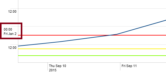
Sometimes, when the values are high, axis labels become difficult to interpret:

Can I set the labels in human-readable format, in appropriate value range, like this:

So far I've just set the axis type as
<param name="charting.axisY">time</param>
to have duration converted to epoch time (starting from 1970-10-01).
However for big duration values my workaround doesn't look very well since full date timestamps are included into label markers for the bottom and top values on the Y-axis.
Is there any way to configure a label convertor for the proper time scale?
- Mark as New
- Bookmark Message
- Subscribe to Message
- Mute Message
- Subscribe to RSS Feed
- Permalink
- Report Inappropriate Content
In the search, where you are calculating the duration, can you add
| fieldformat timeVariable = tostring(timeVariable,"duration")
I don't know if this will help on the chart in advanced XML, but it would make the durations look better in a table...
- Mark as New
- Bookmark Message
- Subscribe to Message
- Mute Message
- Subscribe to RSS Feed
- Permalink
- Report Inappropriate Content
I don't think there is a way to use one representation (such as epoch time) for the data values and a different (though corresponding) representation for the scale... if fieldformat doesn't do it, then I don't know what will.
- Mark as New
- Bookmark Message
- Subscribe to Message
- Mute Message
- Subscribe to RSS Feed
- Permalink
- Report Inappropriate Content
As for the tabular data, yes, I've already done so.
But still looking for a solution on axis labels...

