- Splunk Answers
- :
- Using Splunk
- :
- Splunk Search
- :
- Average Daily Unique category by Weekday for a pe...
- Subscribe to RSS Feed
- Mark Topic as New
- Mark Topic as Read
- Float this Topic for Current User
- Bookmark Topic
- Subscribe to Topic
- Mute Topic
- Printer Friendly Page
- Mark as New
- Bookmark Message
- Subscribe to Message
- Mute Message
- Subscribe to RSS Feed
- Permalink
- Report Inappropriate Content
Average Daily Unique category by Weekday for a period of 1 month
I am creating a search that counts the daily unique category from a proxy log. I want to show the average number of unique website category by weekday over a month.
My issue is that I have created a successful search for 1 category but need to know how to count for different category over week days and show them on one chart.
My query:
Host=proxy1 category=business-and-economy | bin span=1d _time | stats count dc(_time) as days by date_wday | eval average_count = count / days
- Mark as New
- Bookmark Message
- Subscribe to Message
- Mute Message
- Subscribe to RSS Feed
- Permalink
- Report Inappropriate Content
I'm not sure if I understood correctly what you are trying, but have you tried:
Host=proxy1 category=* | bin span=1d _time | stats count dc(_time) as days by date_wday, category | eval average_count = count / days
- Mark as New
- Bookmark Message
- Subscribe to Message
- Mute Message
- Subscribe to RSS Feed
- Permalink
- Report Inappropriate Content
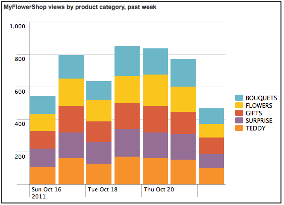
Thanks for your reply, let me be more clear. I want to create a stacked column chart as shown below. With each colour representing a different category with the (AVG)weekday count superimposed on them.
- Mark as New
- Bookmark Message
- Subscribe to Message
- Mute Message
- Subscribe to RSS Feed
- Permalink
- Report Inappropriate Content
I ran the following query and ended up with the below result. But I would like to know how I can get the result for other categories on the same chart?
host=proxy1 category=business-and-economy | bucket _time span=1d | stats avg(count) dc(_time) as days by date_wday | eval average_count = count / days
Introducing the 2024 SplunkTrust!
Introducing the 2024 Splunk MVPs!
Splunk Custom Visualizations App End of Life
