- Apps and Add-ons
- :
- All Apps and Add-ons
- :
- Adding dotted horizontal lines to my chart
- Subscribe to RSS Feed
- Mark Topic as New
- Mark Topic as Read
- Float this Topic for Current User
- Bookmark Topic
- Subscribe to Topic
- Mute Topic
- Printer Friendly Page
- Mark as New
- Bookmark Message
- Subscribe to Message
- Mute Message
- Subscribe to RSS Feed
- Permalink
- Report Inappropriate Content
Adding dotted horizontal lines to my chart
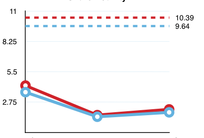
I have these charts generated with my dashboard. I wanted to added two dotted lines to my chart like in the image below at 10.39 and 9.64 (this is done in numbers):
Do I have to make the edits in xml or is there a query that can accomplish this.
Dashboard:
 <dashboard>
    <label>Perf Tests</label>
 <search id="First_Base_Search">
     <query>index=Auto log!=null location=farm</query>
 </search>
<row>
  <panel>
    <chart>
      <title>September Chart</title>
      <search base="First_Base_Search">
        <query>search fruit=apple | rename growTime as Duration | stats perc50(totalTimes) as s50,  perc90(totalTimes) as s90 by Duration | table Duration, s50, s90 | untable Duration, percentile, value | chart first(value) over Duration  by percentile</query>
        <earliest>$earliest$</earliest>
        <latest>$latest$</latest>
        <refresh>1m</refresh>
        <refreshType>delay</refreshType>
      </search>
      <option name="charting.axisLabelsX.majorLabelStyle.rotation">-45</option>
      <option name="charting.chart">line</option>
      <option name="charting.drilldown">none</option>
      <option name="refresh.display">none</option>
      <option name="charting.lineWidth">3</option>
    </chart>
  </panel>
  <panel>
    <chart>
      <title>November Chart</title>
      <search base="First_Base_Search">
        <query>search fruit=pear | rename growTime as Duration | stats perc50(totalTimes) as s50, perc90(totalTimes) as s90 by Duration | table Duration, s50, s90 | untable Duration, percentile, value | chart first(value) over Duration  by percentile</query>
        <earliest>$earliest$</earliest>
        <latest>$latest$</latest>
        <refresh>1m</refresh>
        <refreshType>delay</refreshType>
      </search>
      <option name="charting.axisLabelsX.majorLabelStyle.overflowMode">ellipsisNone</option>
      <option name="charting.axisLabelsX.majorLabelStyle.rotation">-45</option>
      <option name="charting.chart">line</option>
      <option name="charting.drilldown">none</option>
      <option name="refresh.display">none</option>
      <option name="charting.lineWidth">3</option>
    </chart>
  </panel>
  <panel>
    <chart>
      <title>December Chart</title>
      <search base="First_Base_Search">
        <query>search fruit=apricot | rename growTime as Duration | stats perc50(totalTimes) as s50, perc90(totalTimes) as s90 by Duration | table Duration, s50, s90 | untable Duration, percentile, value | chart first(value) over Duration  by percentile</query>
        <earliest>$earliest$</earliest>
        <latest>$latest$</latest>
        <refresh>1m</refresh>
        <refreshType>delay</refreshType>
      </search>
      <option name="charting.axisLabelsX.majorLabelStyle.rotation">-45</option>
      <option name="charting.chart">line</option>
      <option name="charting.drilldown">none</option>
      <option name="refresh.display">none</option>
      <option name="charting.lineWidth">3</option>
    </chart>
  </panel>
</row>
  </dashboard>
- Mark as New
- Bookmark Message
- Subscribe to Message
- Mute Message
- Subscribe to RSS Feed
- Permalink
- Report Inappropriate Content
@wajeeh911 before we start looking at the request, you should also read about Post Processing best practices. As per your dashboard code, for best practices and better performance, you should have base search like following:
  <search id="First_Base_Search">
      <query>index=Auto log!=null location=farm fruit IN ("apple","pear","apricot")
 | stats perc50(totalTimes) as s50, perc90(totalTimes) as s90 by fruit growTime</query>
  </search>
PS: The final command in the base search above is a transforming command, which reduces the results to the rows we are interested in. Instead of passing on the raw events.
Then change individual sub searches for panels like the following:
<search base="First_Base_Search">
    <query> search fruit=pear
    | rename growTime as Duration
    | table Duration s50 s90
    | eval threshold1=70, threshold2=80</query>
</search>
Besides above change related to post processing best practices, in order to have Dashed lines for Threshold you should try the charting.fieldDashStyles Simple XML Configuration, which is available in Splunk version 7 and above: https://docs.splunk.com/Documentation/Splunk/latest/Viz/ChartConfigurationReference
Following is a run anywhere example explaining both. Please try out and confirm!
<dashboard>
  <label>Chart with Dashed lines</label>
  <search id="First_Base_Search">
    <query>index=_internal sourcetype=splunkd cpu_seconds=* name IN ("indexerpipe","exec","merging")
| stats perc50(date_second) as s50,  perc90(date_second) as s90 by date_wday name
| eval s50=round(s50,2), s90=round(s90,2)</query>
    <earliest>-7d@d</earliest>
    <latest>now</latest>
    <sampleRatio>1</sampleRatio>
  </search>
  <row>
    <panel>
      <chart>
        <search base="First_Base_Search">
          <query>search name="indexerpipe"
| table date_wday s50 s90
| eval threshold1=70, threshold2=80</query>
        </search>
        <option name="charting.axisLabelsX.majorLabelStyle.rotation">-45</option>
        <option name="charting.chart">line</option>
        <option name="charting.drilldown">none</option>
        <option name="charting.fieldColors">{"s50":"#87ceeb","s90":"#cc0000","threshold1":"#87ceeb","threshold2":"#cc0000"}</option>
        <option name="charting.fieldDashStyles">{"threshold1":"shortDash","threshold2":"shortDash"}</option>
      </chart>
    </panel>
    <panel>
      <chart>
        <search base="First_Base_Search">
          <query> search name="exec"
| table date_wday s50 s90
| eval threshold1=70, threshold2=80
          </query>
        </search>
        <option name="charting.axisLabelsX.majorLabelStyle.rotation">-45</option>
        <option name="charting.chart">line</option>
        <option name="charting.drilldown">none</option>
        <option name="charting.fieldColors">{"s50":"#87ceeb","s90":"#cc0000","threshold1":"#87ceeb","threshold2":"#cc0000"}</option>
        <option name="charting.fieldDashStyles">{"threshold1":"shortDash","threshold2":"shortDash"}</option>
      </chart>
    </panel>
    <panel>
      <chart>
        <search base="First_Base_Search">
          <query> search name="merging"
| table date_wday s50 s90
| eval threshold1=70, threshold2=80
          </query>
        </search>
        <option name="charting.axisLabelsX.majorLabelStyle.rotation">-45</option>
        <option name="charting.chart">line</option>
        <option name="charting.drilldown">none</option>
        <option name="charting.fieldColors">{"s50":"#87ceeb","s90":"#cc0000","threshold1":"#87ceeb","threshold2":"#cc0000"}</option>
        <option name="charting.fieldDashStyles">{"threshold1":"shortDash","threshold2":"shortDash"}</option>
      </chart>
    </panel>
  </row>
</dashboard>
| makeresults | eval message= "Happy Splunking!!!"
- Mark as New
- Bookmark Message
- Subscribe to Message
- Mute Message
- Subscribe to RSS Feed
- Permalink
- Report Inappropriate Content
You can add your static values just by adding an eval to the end of your search
search fruit=pear
| rename growTime as Duration
| stats perc50(totalTimes) as s50, perc90(totalTimes) as s90 by Duration
| table Duration, s50, s90
| untable Duration, percentile, value
| chart first(value) over Duration by percentile
| eval threshold1 = 10.39
| eval threshold2 = 9.64
But I don't know how to make them dashes so hopefully someone else can help with that.


